


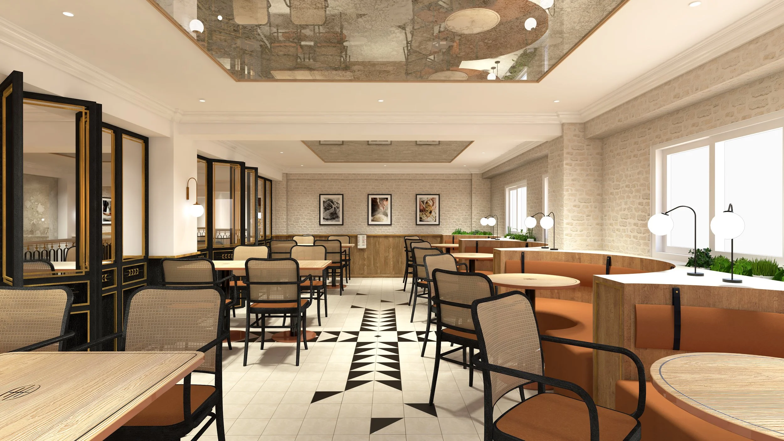


The name ‘House of Bread’ is derived from the bible which means Bethlehem, where Jesus was born. House of Bread is a french style bakery cafe/boulangerie, aimed at the young affluent crowd in Yangon. Made only with premium ingredients, House of Bread wants to position itself as a premium bakery café.
The branding concept took a somewhat literal approach, as the name implies. The logomark is constructed to form the shape of bread, with the acronym HOB embedded in it. Modern engraved-inspired font is used for the logotype to communicate the feeling of traditional boulangerie. Wheat, the base ingredient of bread is used as a part of the brand elements. Triangles form the signature wheat icon and also used as the base shape to form brand pattern. Triangle also represents the Trinity in Christianity.
The color palette is made of warm tones to create a friendly and welcoming ambience. Amber tone is chosen as signature color to represent bricks which are commonly found in traditional boulangerie. Beige tones and black are used as cushion colors to balance the palette. Gold is used as an accent for that ‘premium’ feeling.